Personal Progression Evaluation
Looking back at your preliminary task, what do you feel you have leart in the progression from it to the full product?
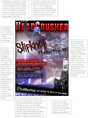
From my preliminary task I took new skills in terms of photography and page layout. However at that point, I did not have enough experience with software to fully understand what could be done. It was when I started to create my main task that I developed these skills further into what then become quite a large understanding of editing software, as well as how the industry works to create an idea or manipulate opinions using a variety of techniques.
Personal technology Learning Evaluation
 n also now use colours to create different effects, using red and black together a lot in my contents page helped to create a dark and disturbing feel, however the white gives hope and sanctuary to the page and shows the idea that 'it is not all doom and gloom'.
Audience Evaluation
The target audience for this magazine are people who listen to metal music, and any sub-genres linked with metal. It is aimed at mainly males between the age of 13 and 30, however females sometimes fit into this genre. Other age categories can be included in this, mostly middle aged people, as they will have grown up with the birth of these genres, and so will have a previous knowledge of the content of the magazine. The audience will be interested in not just the music, but also events, people and objects linked with metal, and so will seize any good opportunity to read about the people or bands behind the music.
How did you attrack/address your audience?
I have addressed the audience in this product by using some edgy fonts for the younger readers, in association with the new feel of the genre, as being rough and harsh. I have also used bold and more sophisticated fonts for the older readers, to show their maturity. The language I have used is appropriate for all readers, as no complicated words are used, while still maintaining a level of sophistication and professionalism.
Distribution Evaluation
Future Publishing are the most likely institution to promote my magazine, as they already have music magazines for similar genres under their belt, including:
Metal Hammer - http://www.metalhammer.co.uk/
Total Guitar - http://www.totalguitar.co.uk/
Rhythm - http://www.rhythemmag.co.uk/
Future Music - http://www.futuremusic.co.uk/
Classic Rock - http://www.classicrockmagazine.com/
Classic Rock presents Prog. - www.classicrockmagazine.com/prog
With these already established magazines under the control of Future Publishing, I think that it would be benefitial for my magazine to operate under the guise of professionals in the area. Future Publishing already have a large market share of the audience for this type of magazine, and so are already familiar and popular with the target audience.
Representation Evaluation
Metal fans are represented in my magazine. Many social groups are part of this genre of music, including goths, metal heads, 'moshers' and nu metallers. The mainstream media represents these social groups as satanic, depressed, self-harming animals. This, however, is not the case, so I have tried to represent these social groups as accurately as possible. Other metal magazines, such as Metal Hammer, already do this, and so I tried to follow their example.
As opposed to the widely known stereotype of blood and violence surrounding the genre, I have tried to show a more mellow and friendly side to metal fans, one that is true and confronts this stereotype. I have shown in the content of the article, as well as the layout of the pages, that there is a sinister side to the genre as a whole, while still maintaining a feeling of informality, coupled with a sense of jocularity.
By using the 'I <3 NY' logo, I was looking to show that the genre has a different side from its commonly misunderstood stereotype. A few years ago, the guitarrist for a band named 'Pantera' was shot onstage. Shortly after his death, a reporter for a major magazine in America wrote an article concerning the event. Sympathising with the deceased's family and fans, he then went on to describe heavy metal fans and all linked with the genre as " Ignorant, semi-human barbarians who were filthy in attire and manner, intellectually incoherant and above all else, ugly to the point of physical deformity". This is a prime example of how the media feeds the general public a negative sterotype, as this is how the upper class (owners of most media institutions) see them.
The full article: http://forums.simcentral.net/showthread.php?t=51797
This is how the mainstream media would portray someone from this genre.

Conventions evaluation
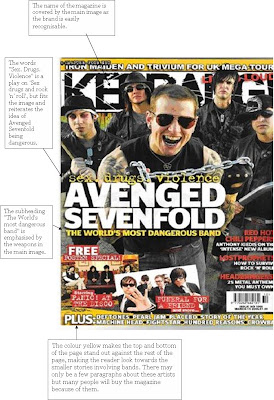
My magazine uses the conventions of a typical metal magazine, such as metal hammer or terrorizer, in terms of colour scheme and layout. However it does challenge some conventions in terms of content. The writing style I have used is not very common in existing publications, however similar styles are becoming more popular in an attempt to become different and more interesting to an audience.
"As we ascend up to the 86th floor of the world famous Empire State Building, it dawns on me that I am in a lift at the top of New York, with a band that are about to cause choas on their first time to the States. Due to bad weather, we are not allowed outside, but that doesn't bother any of us." - Headcrusher, Soilborne article
"The name sounds like the latest Quentin Tarantino movie, and in reality Five Finger Death Punch really do live up to the brutal nomeclature. As they show on their debut album, 'The Way Of The Fist', this Los Angles five-piece can mix up blood-letting riffs with roaring lyrical aggression." - Metal Hammer, Five Finger Death Punch article
Trial post for AS Media blog
The preliminary task is to create the same four pages for a school newsletter, and again to use original photographs. I will record my progress with both magazines via this blog, and will put up designs and ideas I have that may or may not benefit the magazines appearance. I will post designs or pictures that I am thinking of using and would appreciate feedback from anybody at all (serious comments only please).


